
I’ve mentioned several times that MCPS is redlined based on affluence: affluent families live in areas where the schools are successful, and struggling families live in areas where the schools struggle along with them. In this post I present a visualization of this claim.
Step 1: Identify the schools’ rankings
Niche.com provides a succinct ranking of Maryland’s high schools. The following table gives the Maryland ranking for all MCPS’s high schools.
|
High School |
Ranking in Maryland |
|
Poolesville |
1 |
|
Whitman |
2 |
|
Churchill |
4 |
|
Wootton |
6 |
|
Walter Johnson |
7 |
|
Richard Montgomery |
8 |
|
Bethesda Chevy-Chase |
9 |
|
Northwest |
12 |
|
Blair |
14 |
|
Quince Orchard |
18 |
|
Clarksburg |
21 |
|
Sherwood |
25 |
|
Damascus |
28 |
|
Wheaton |
38 |
|
Rockville |
39 |
|
Blake |
44 |
|
Einstein |
46 |
|
Magruder |
54 |
|
Springbrook |
57 |
|
Seneca Valley |
58 |
|
Paint Branch |
73 |
|
Gaithersburg |
88 |
|
Northwood |
101 |
|
Watkins Mill |
109 |
|
Kennedy |
Unranked |
Poolesville High School ranks #1 in all of Maryland (wow!), while Kennedy High School isn’t ranked. Watkins Mill ranks 109 out of approximately 290 high schools in all of Maryland.
Step 2: Measure affluence
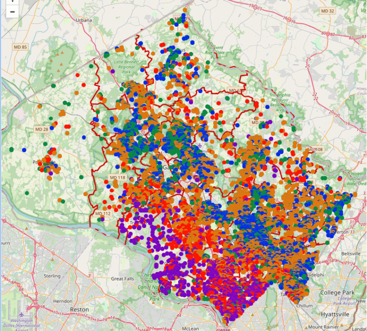
To measure a household’s affluence, I took available sales data for the first quarter of 2023. Each sale is binned and colored as follows:
|
Price point |
Percentile |
Color |
|
0–100,000 |
30% |
green |
|
100,001–400,000 |
50% |
blue |
|
400,001–558,556 |
80% |
orange |
|
558,557–960,000 |
90% |
red |
|
960,001+ |
100% |
violet |
In the following map you see a preponderance of red and violet transactions in the southwestern part of the county, and a preponderance of green and blue transactions in the central and southeastern areas.
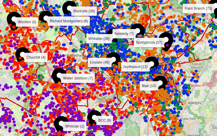
Step 3: Map affluence against school ranking
The following map (takes a while to load) does show a correlation between the price of a house and the associated high school. The Poolesville cluster has a healthy diversity of affluence, albeit among a dearth of transactions. The other high-performing clusters (Whitman, BCC, WJ, Churchill, and Wootton) are safely within affluent regions, while Wheaton, Kennedy, and Einstein are concentrated in less affluent areas.
Step 4: Conclusions
The biggest drawback to this visualization is that it includes only sales prices of homes. There is no representation of renters. I hope to add such data in a future study.
Nevertheless, there is a strong correlation between a home’s sales price and the associated school’s performance. If you live an an area where the home prices are high, the chances are extremely good that your children are attending a successful school. If you live in an underserved area, the chances are also high that your children are attending a struggling school.
Interestingly, successful Northwood is in an affluently diverse area. That shows it is possible to deliver quality education to those families who live modest neighborhoods. Unfortunately that opportunity is denied to most students and families in the count’s underserved areas.